How to Add Dark Mode to a React Application
A step-by-step walkthrough for adding the ability to toggle themes to your React application using React Context and Styled Components.
Dark user interfaces are a wonderful thing. Not only are they easier on the eyes by helping to reduce blue light exposure and reduce eye strain, they are also easier on your devices resources as less light is emitted.
Believe it or not, there are actually people out there that swear by using dark interfaces, and not having the option to view your application in this mode can be a huge negative.
You could just style your application dark by default, however there may be others that dislike this as it's not typically the norm (I know -- picky right?). So, how can you meet light and dark interface users in the middle?
Give them the ability to select between a light or dark mode!
This will be a step-by-step guide on how I'd go about building a theme-toggling component using styled-components and React Context.
Let's get started!
1. Creating a Basic ThemeToggle Component
To control the theme that is being used, we will need to add some way the user can toggle the theme. This component should have a button that can be clicked, and some indication of the current theme.
So let's create a new component, ThemeToggle, which returns a button and some text. We will also define a function that will eventually toggle our theme that will be triggered on our button's click event.
const ThemeToggle = () => {

  const toggle = () => {
    console.log('toggling!');
  };

  return (
    <div>
      <button onClick={toggle}>toggle</button>
      <p>theme name</p>
    </div>
  );
};
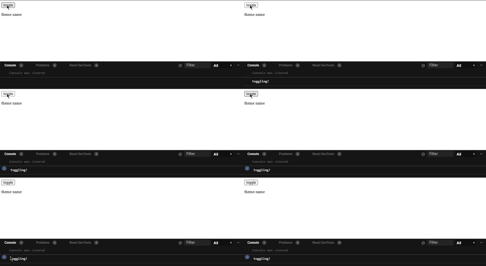
For now, all the toggle method will do is log the message toggling! to the console.

The next step would be to use state to maintain our current theme. Inside the toggle method, we will set our theme state based on the current theme; if we have a light theme, we will set the theme to dark, otherwise we set it to light. I am also replacing the text with theme so that can see which theme is currently set.
const ThemeToggle = () => {
  const [theme, setTheme] = useState('light')

  const toggle = () => {
    theme === 'light'
      ? setTheme('dark')
      : setTheme('light');
  };

  return (
    <div>
      <button onClick={toggle}>toggle</button>
      <p>{theme}</p>
    </div>
  );
};
With this, we've introduced the concept of light and dark themes which we can toggle on button click.

This is sweet and all, but we are still far away from achieving our goal. Next we need to start making use of styled-components and its theming functionality.
2. Introducing Theming from styled-components
styled-components is a css-in-js library that makes it super simple to style your components. It also provides some additional theming functionality that we're going to take advantage of in this tutorial. There are two things we need from styled-components:
ThemeContextcreateGlobalStyle
ThemeContext
This is an instance of React.Context, to which we can assign a value and access from other components via the useContext hook. This is useful so we don't need to pass the theme as props everywhere. We will be using ThemeContext so that we can access the current theme as well as the toggle callback anywhere in our application.
We could also use
ThemeProviderfor this purpose, but in this example we'll want to use context so that theThemeTogglecomponent can access a callback to toggle the theme.ThemeProviderdoesn't allow us to distribute any props other thantheme.
createGlobalStyle
This is a helper that lets you define styles you'd like to apply to globally. Although not required, this makes it easier to define styles we'd like to apply application-wide.
Before we get started, let's first install styled-components.
npm install styled-components
And let's get some basic light and dark themes going.
const darkTheme = {
  name: 'dark',
  body: '#222',
  text: '#FFF',
};

const lightTheme = {
  name: 'light',
  body: '#FFF',
  text: '#222',
};

// this is what we'll end up exporting
const themes = {
  dark: darkTheme,
  light: lightTheme,
};
Note the inclusion of a property
namefor each theme. This property will be used for determining the current theme later on.
Now that we have the package and some basic themes defined, let's use createGlobalStyle to create some styles that will take advantage of our themes.
const GlobalStyles = createGlobalStyle`
  body {
    background: ${props => props.theme.body};
    color: ${props => props.theme.text};
  }
`;
If you've never used props in styled-components before, feel free to check out their docs. Essentially what's going on is that we're accessing our theme's properties through GlobalStyles's props.
The next step would be to start placing these theming components in the App, wrapping the app's child components.
const App = () => {
  return (
    <ThemeContext.Provider>
      <GlobalStyles />
      <ThemeToggle />
      <h1>Dark mode demo</h1>
    </ThemeContext.Provider>
  );
}
Before we start seeing any results, we need to solve an issue. At the moment, we have no way to get user's chosen theme in App as it's being set and changed in ToggleTheme. Since it is a child component, we aren't able to propogate any state upwards unless we have some sort of callback function. So as things are written, there is no way to get a theme into ThemeContext or GlobalStyles.
Let's fix that.
3. Refactoring Theme Logic to Share Current Theme
So we'll need to pull that logic out of ThemeToggle, put it into the top-level App, and then pass it back down. Passing data from parents to children is made super simple with Context, which is why I've chosen to use ThemeContext in the first place. It allows us to access any values stored in context in any component that pulls in the context.
First we'll create a hook to contain the theme-toggling logic (let's call it useThemes). After pulling the logic out of ThemeToggle, this is what it looks like.
const useThemes = () => {
  const [theme, setTheme] = useState('light')

  const toggle = () => {
    theme === 'light'
      ? setTheme('dark')
      : setTheme('light');
  };

  return [theme, toggle]
};
This looks great, but I'm going to make one slight change. Instead of our theme state being a string (light/dark), our state is going to be one of the themes we've defined above. This will simplify things later on so we don't have to import the themes wherever we go.
const useThemes = () => {
  const defaultTheme = themes.light;
  const [theme, setTheme] = useState(defaultTheme);

  const toggle = () => {
    theme.name === themes.light.name // this is where we use the name property
      ? setTheme(themes.dark)
      : setTheme(themes.light);
  };

  return [theme, toggle]
};
I really like this minor change as it gets rid of any magical strings in our hook!
Now that we've decoupled our theme-toggling logic from the ThemeToggle component, we can let App make use of it. We will pass the resulting theme state and toggleTheme callback into our theming components, ThemeContext and GlobalStyles.
const App = () => {
  const [theme, toggleTheme] = useThemes();

  return (
    <ThemeContext.Provider value={{ theme, toggleTheme }}>
      <GlobalStyles theme={theme} />
      <ThemeToggle />
      <h1>Dark mode demo</h1>
    </ThemeContext.Provider>
  );
}
And the final piece of this refactor is getting theme and toggleTheme back into ThemeToggle so the user can both see the current theme and toggle it.
const ThemeToggle = () => {
  const { theme, toggleTheme } = useContext(ThemeContext);

  return (
    <div>
      <button onClick={toggleTheme}>toggle</button>
      <p>{theme.name}</p>
    </div>
  );
};
Doesn't that look nice? Using ThemeContext to fetch our theme state has definitely cleaned ThemeToggle right up!
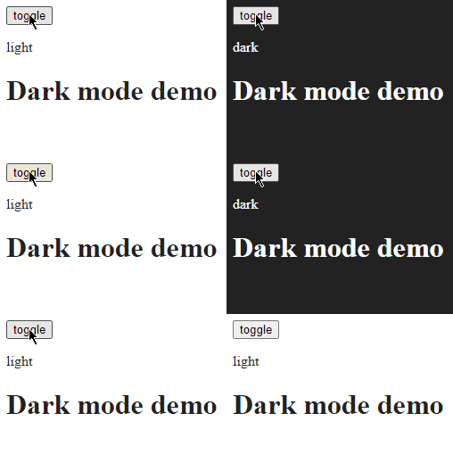
Finally, we have some tangible results!

Although we got everything to work, it looks sort of ugly... so let's spruce things up with some styling using styled-components.
4. Sprucing Things Up
First thing I've decided to do is pull in some FontAwesome packages which I'll use for some icons to represent our themes.
npm install @fortawesome/fontawesome-svg-core
npm install @fortawesome/free-solid-svg-icons
npm install @fortawesome/react-fontawesome
And I've defined some styled components which utilize the current theme to inform their properties. Below is a dump of the whole ThemeToggle component after styling it (as well as some minor changes to our themes).
const ToggleContainer = styled.div`
  height: 40px;
  width: 100px;
  display: flex;
  flex-direction: ${props => (props.theme.name === 'light' ? "row" : "row-reverse")};
  background-color: ${props => props.theme.themeToggle.container.background};
  color: ${props => props.theme.themeToggle.container.text};
  align-items: center;
  border-radius: 50px;
  padding: 5px 7px;
`;

const ToggleButton = styled.button`
  border: 0;
  background-color: ${props => props.theme.themeToggle.button.background};
  color: ${props => props.theme.themeToggle.button.text};
  border-radius: 50%;
  padding: 10px;
  cursor: pointer;
`;

const ToggleText = styled.p`
  text-transform: uppercase;
  margin: 0;
  padding: 0 10px;
`;

const ThemeToggle = () => {
  const { theme, toggleTheme } = useContext(ThemeContext);

  return (
    <ThemeProvider theme={theme}>
      <ToggleContainer>
        <ToggleButton onClick={toggleTheme}>
          {
            theme.name === 'light'
              ? <FontAwesomeIcon icon={faSun} />
              : <FontAwesomeIcon icon={faMoon} />
          }
        </ToggleButton>
        <ToggleText>{theme.name}</ToggleText>
      </ToggleContainer>
    </ThemeProvider>
  );
};
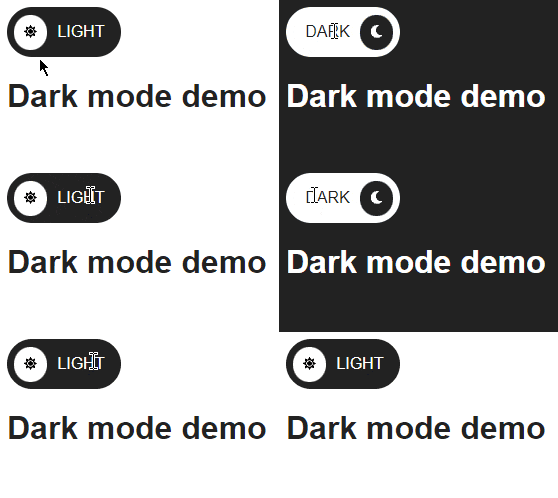
And voila! We have a beautiful button that helps us toggle our application's theme.

Wrapping up...
Although having the option to change themes on a website isn't absolutely crucial, it definitely is a nice thing to have. It gives the user options to customize their experience on your site and make it more enjoyable. In my opinion, the advantages to offering a dark mode option outweigh the effort involved in implementing and maintaining it. This is especially true now that you've followed a step-by-step guide on how to get started!
Although this method seems foolproof, there will be issues persisting the user's choice on refresh and across sessions. In the next tutorial, I'll follow up on this and provide a solution for this using local storage.
If you want to play around with the code, check out this CodeSandbox .
Thanks for reading, now go build some stuff!

